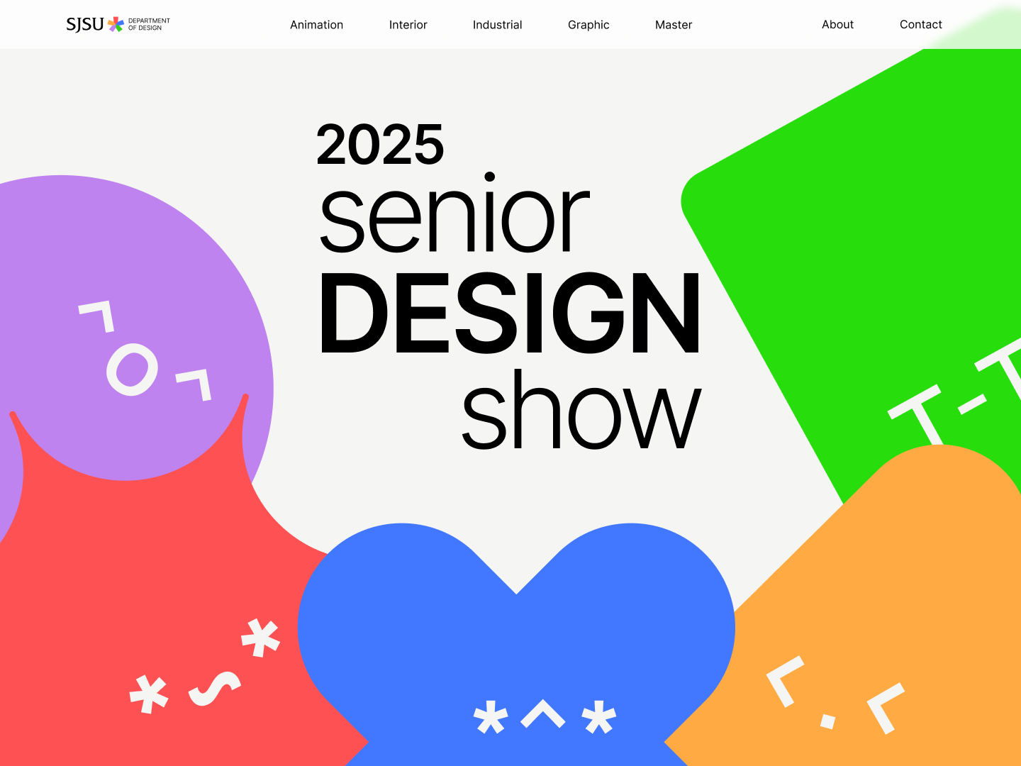
Senior Show Website Redesign
I was on the UX Design team for this project. I contributed to a fully redesigned site architecture, wireframing for all screens, creating a motion design for the site logo, and working closely with the Visual Design team to create a seamless experience for clients and site visitors.

01
Project Overview
Problem Statement
The SJSU Department of Design needed a fresh and engaging redesign of their Senior Design Show website to better represent the talent and diversity of its graduating students. The existing site lacked visual impact, consistency, and usability, making it difficult to showcase student work professionally to potential employers, faculty recruiters, and prospective students.
With 81 graduating seniors across multiple disciplines, the new site had to effectively highlight up to three projects per student, reflect the department’s creative culture, and serve as both a professional pseudo-portfolio and a recruiting tool.
Design Solutions
Increase student visibility
Support student career growth
Strengthen the department’s reputation for producing top-tier designers, animators, and illustrators
02
Getting Started
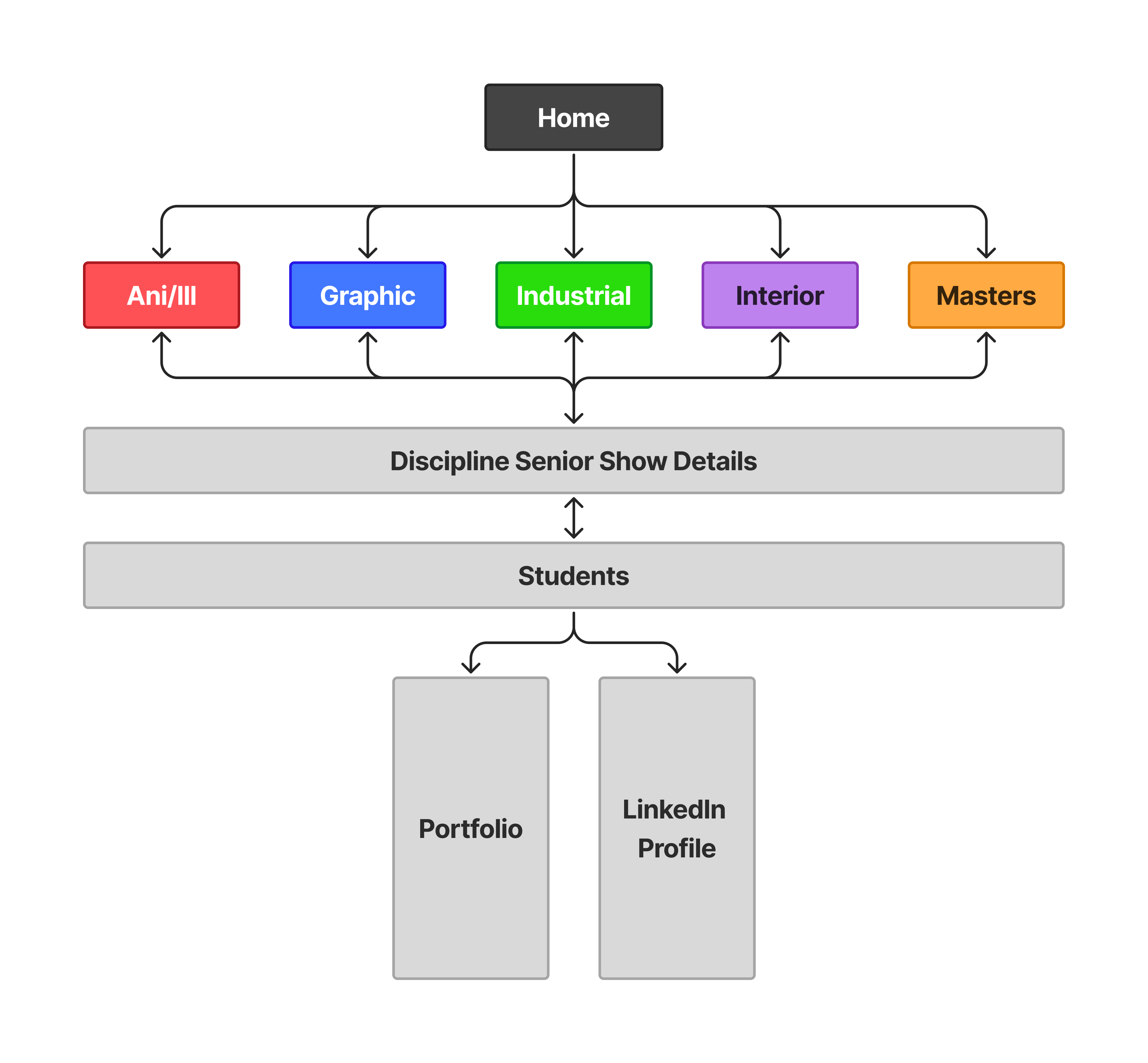
Information Architecture
The site architecture was designed to create a simple, intuitive, and scalable structure that effectively organizes content by discipline while highlighting individual students and their work.
Home Page Sketches
I contributed to the design of all pages on the website, however the home page was the most challenging. We wanted to convey the most important information but designed in a way that conveyed “colorful minimalism,” which was the design direction for this project, without being overwhelming or loud.
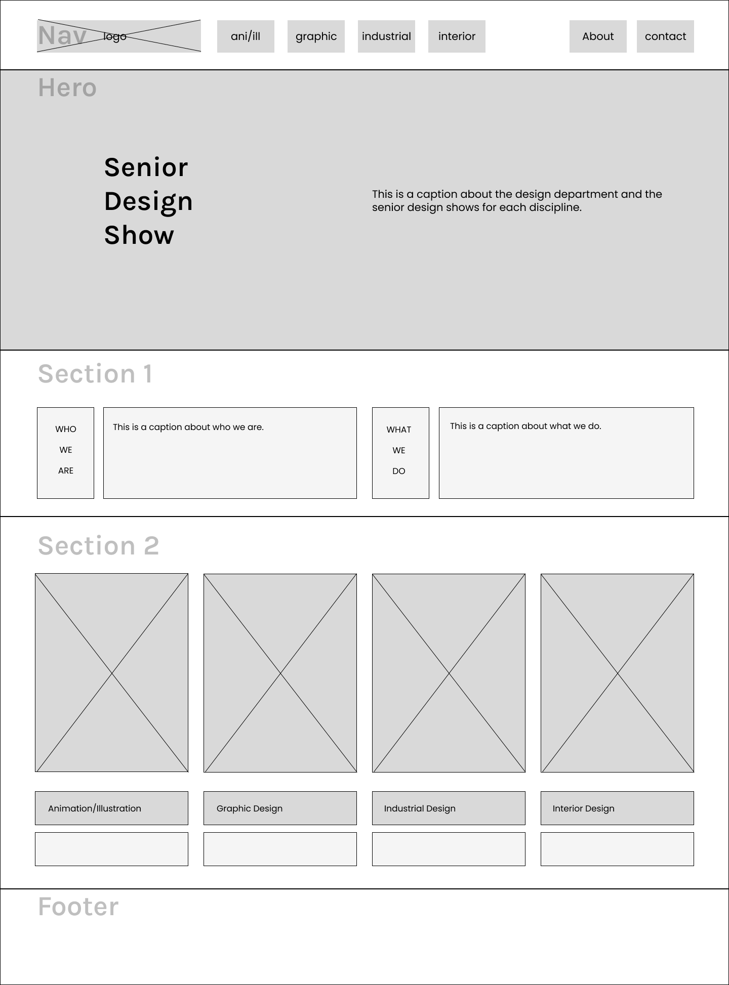
Sketch #1
This sketch introduces the Senior Design Show with a bold hero section, followed by informational content and the department and its disciplines. Below is a visual showcase of the different senior shows that directs users to each discipline.
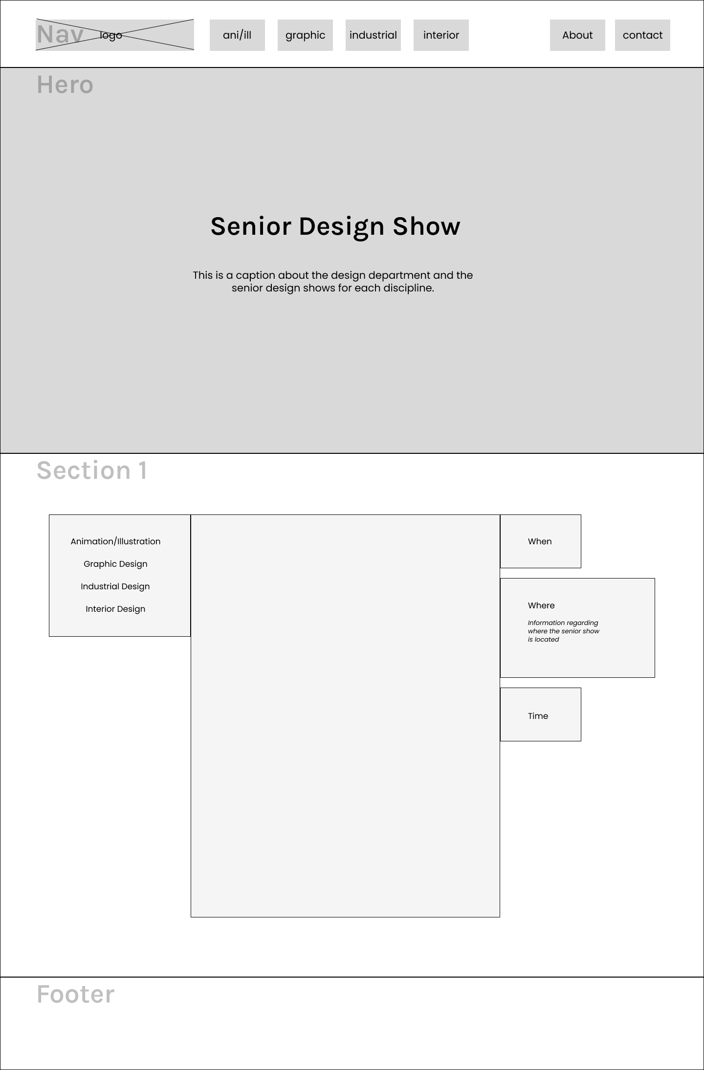
Sketch #2
This sketch emphasizes event-focused content, combining a bold hero introduction with a section that highlights each design discipline alongside key senior show details.
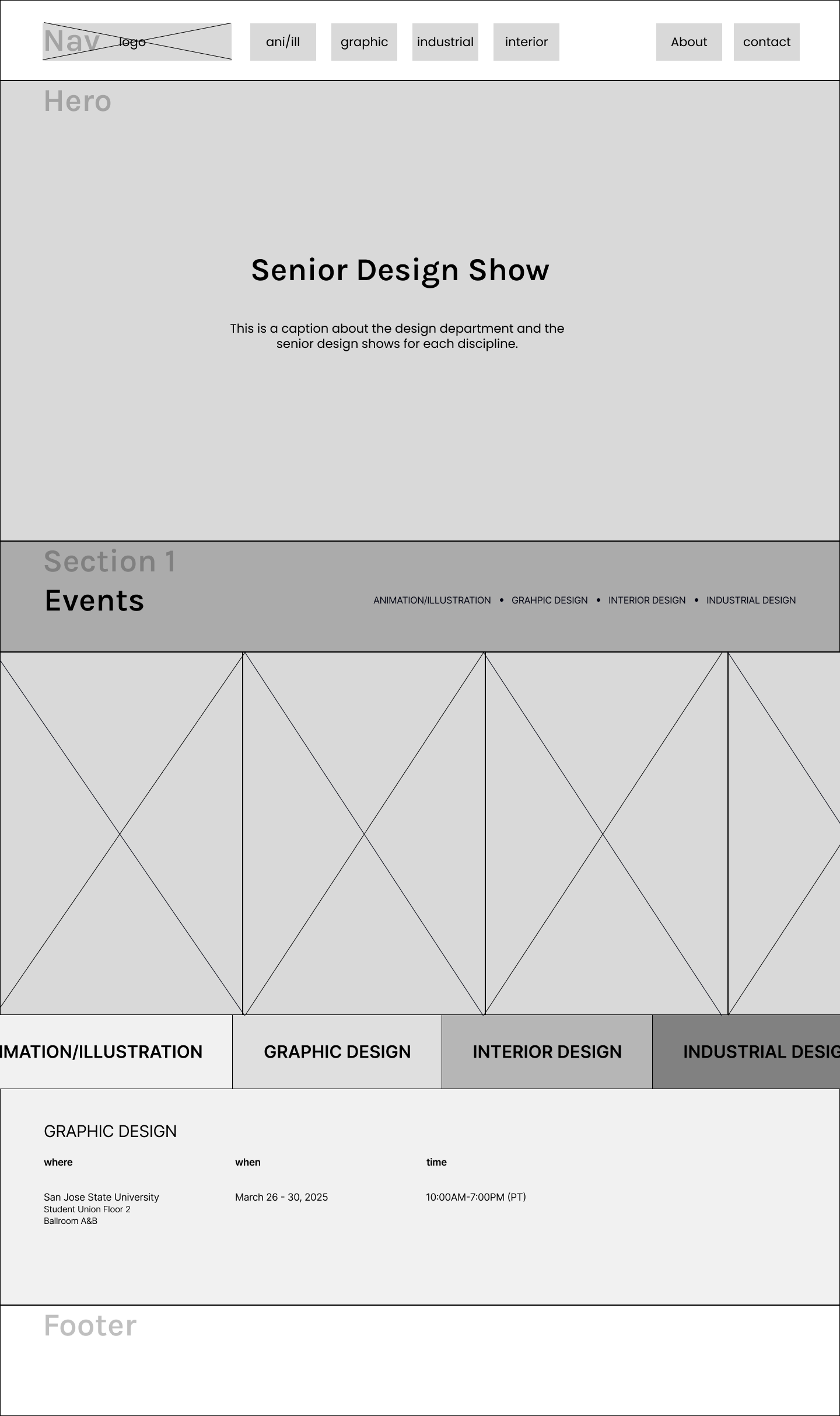
Sketch #3
For this sketch I went with a more bold layout. Focusing on a more engaging experience. A structured layout that supports the emphasis of the senior show posters and details as well as short descriptions of all disciplines.

High Fidelity Home Wireframe
I landed on this bento-style design for the home page. I made an iteration of this design with alternating blocks of image and text, however when working with auto-layout and the responsiveness of the design, that iteration did not work as intended. The layout would get mixed up, making text boxes shift and not align with the image they were paired with. To solve that issue we stuck with this repeating bento design with an image of the senior show posters, a color block with the discipline’s description and a CTA to check out more of each discipline.
03
Refining Details: Navigation & Footer
Nav Bar: Natural/Active State
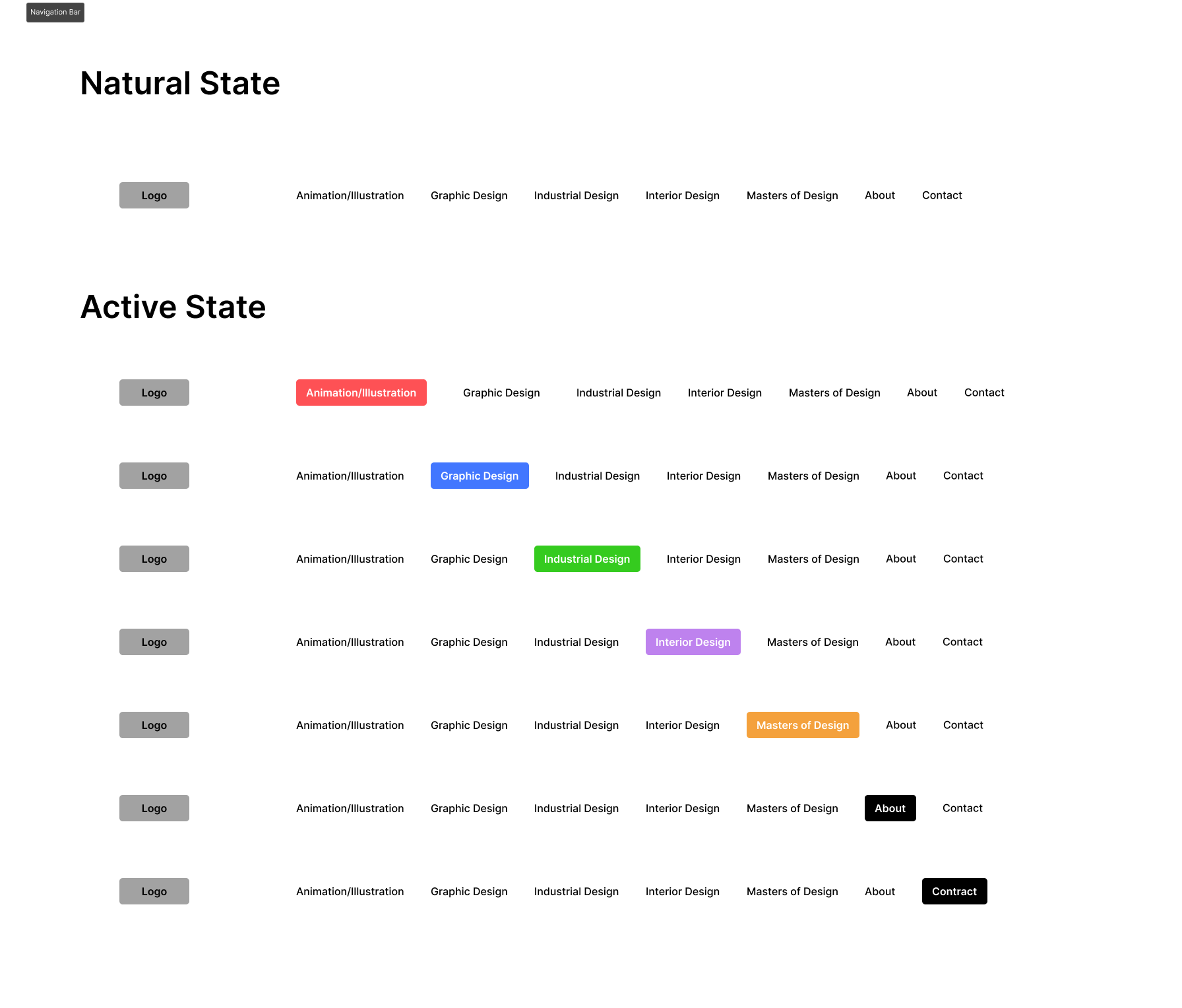
I was responsible for designing the navigation for the website. I started with a few iterations and after some testing. I found that giving more space for the logo and adding blocks of color behind the individual tabs enhanced the visibility and ensured streamlined navigation.
We ended up refining the labeling of the tabs in the final version of the navigation.
Footer & Logo Animation
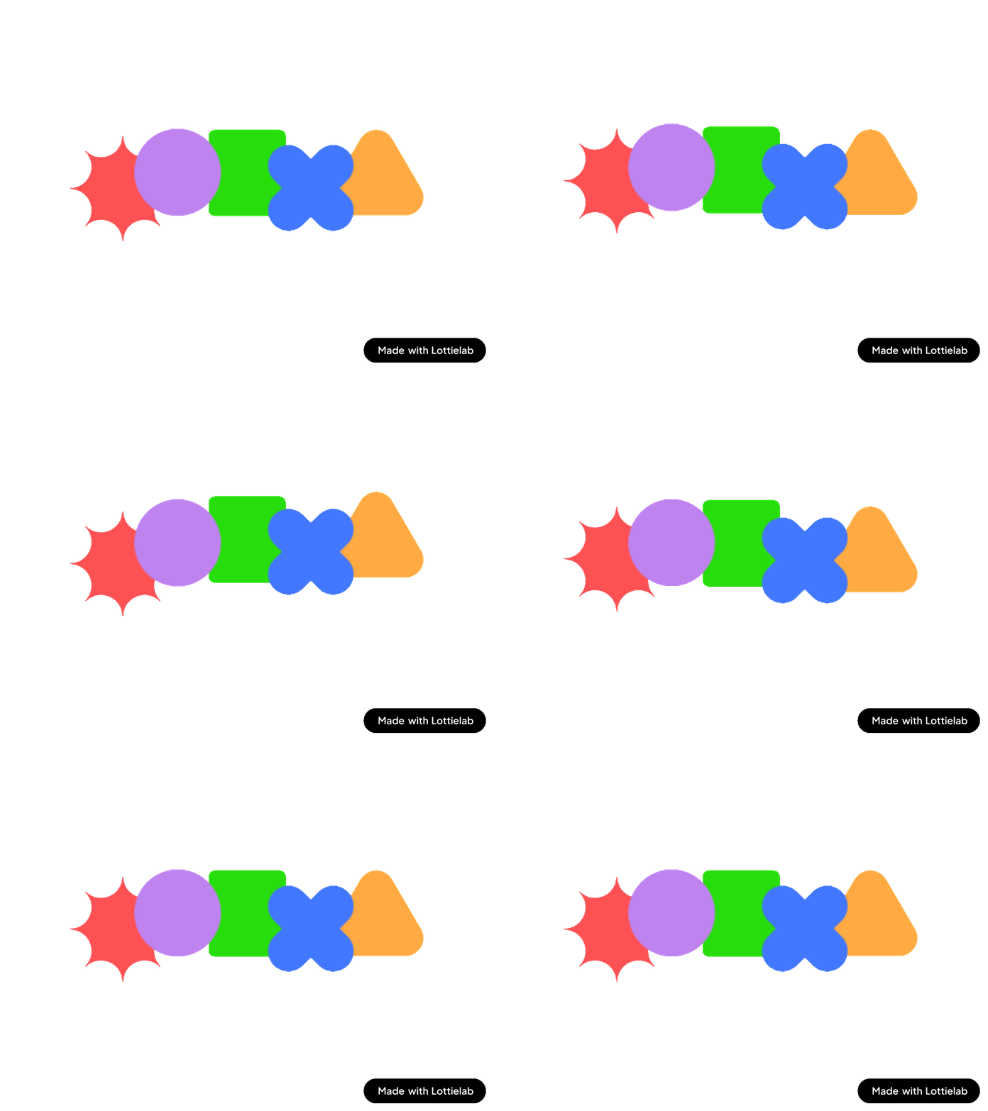
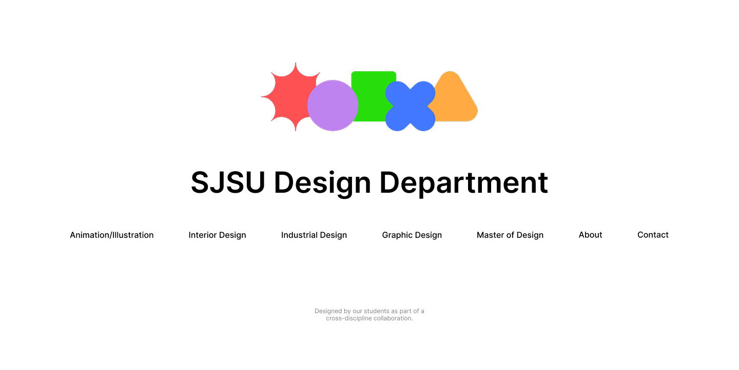
We wanted to bring the website to life by adding some motion, so I was tasked with designing the footer and an animation for the logo. I landed on a minimal wave motion that loops seamlessly.
05
Final Website
Curious to learn more about this project?
Shoot me a message below!
Thank you! Your submission has been received!
Oops! Something went wrong while submitting the form.
